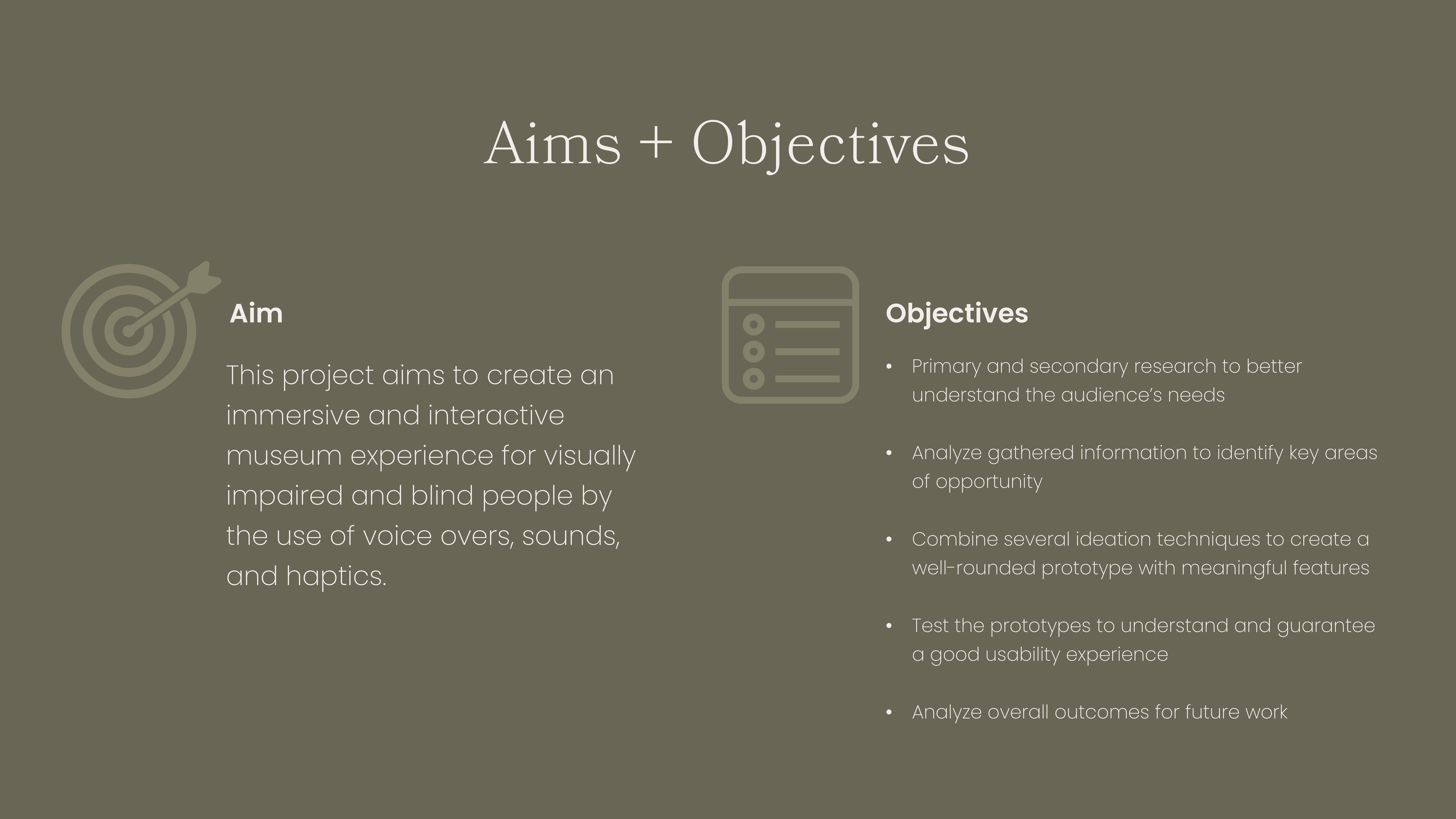
This project aims to create an immersive and interactive digital museum experience for visually impaired and blind people by the use of voice overs, sounds, and haptics. Although the focus audience is the blind and visually impaired, the app will be inclusive to all users with features such as "turning the lights off" that would turn the screen balck, allowing all users to experience the app as a blind person would. This project has allowed me the opportunity to closely collaborate with the Royal National Institute of Blind People (RNIB), and includes extensive research on the subject matter as well as several rounds of user testing.
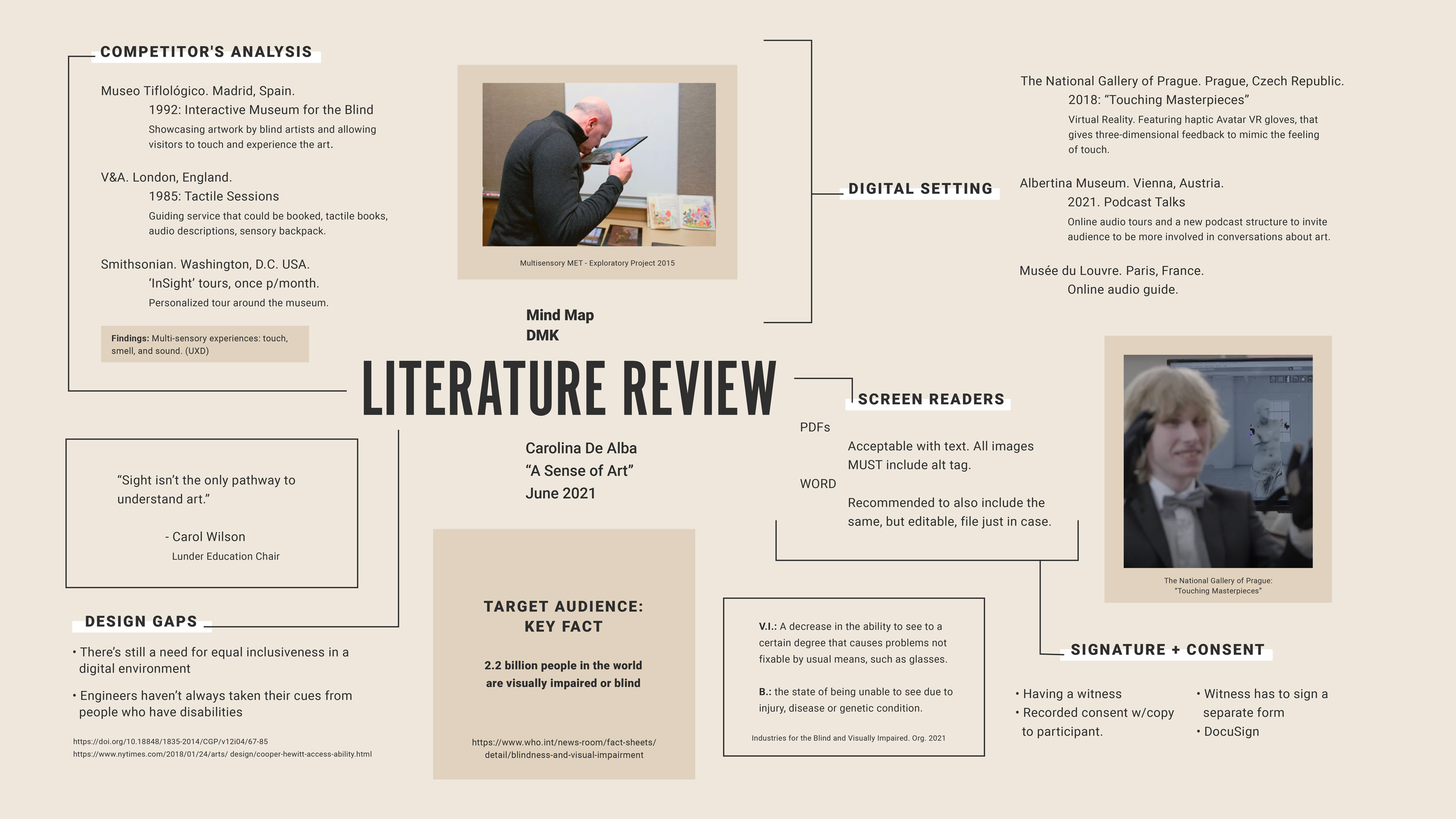
Showcasing an overview of the research gathered, including facts such as how many visually impaired and blind people are in the world (according to WHO); the definition of "blind" and "visually impaired", the current design gaps when it comes to this audience, how in-person inclusiveness began in museum and how it translates into a digitial setting, and the required technology to work with this audience.

• How is this audience represented, considered, and accounted for when it comes to the design and development of basic human experiences?
• How has inclusiveness adapted into the digital world we are currently dependent on?
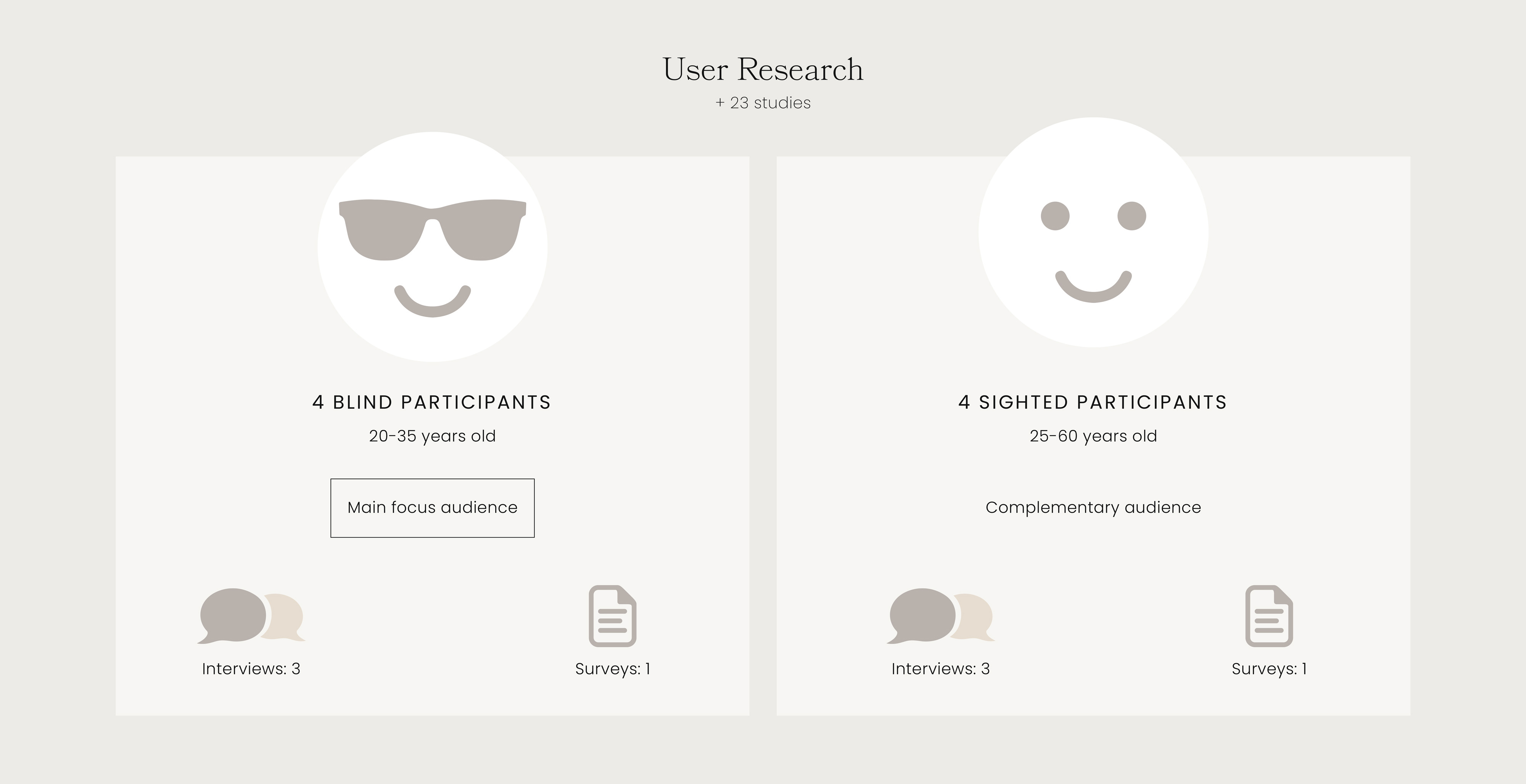
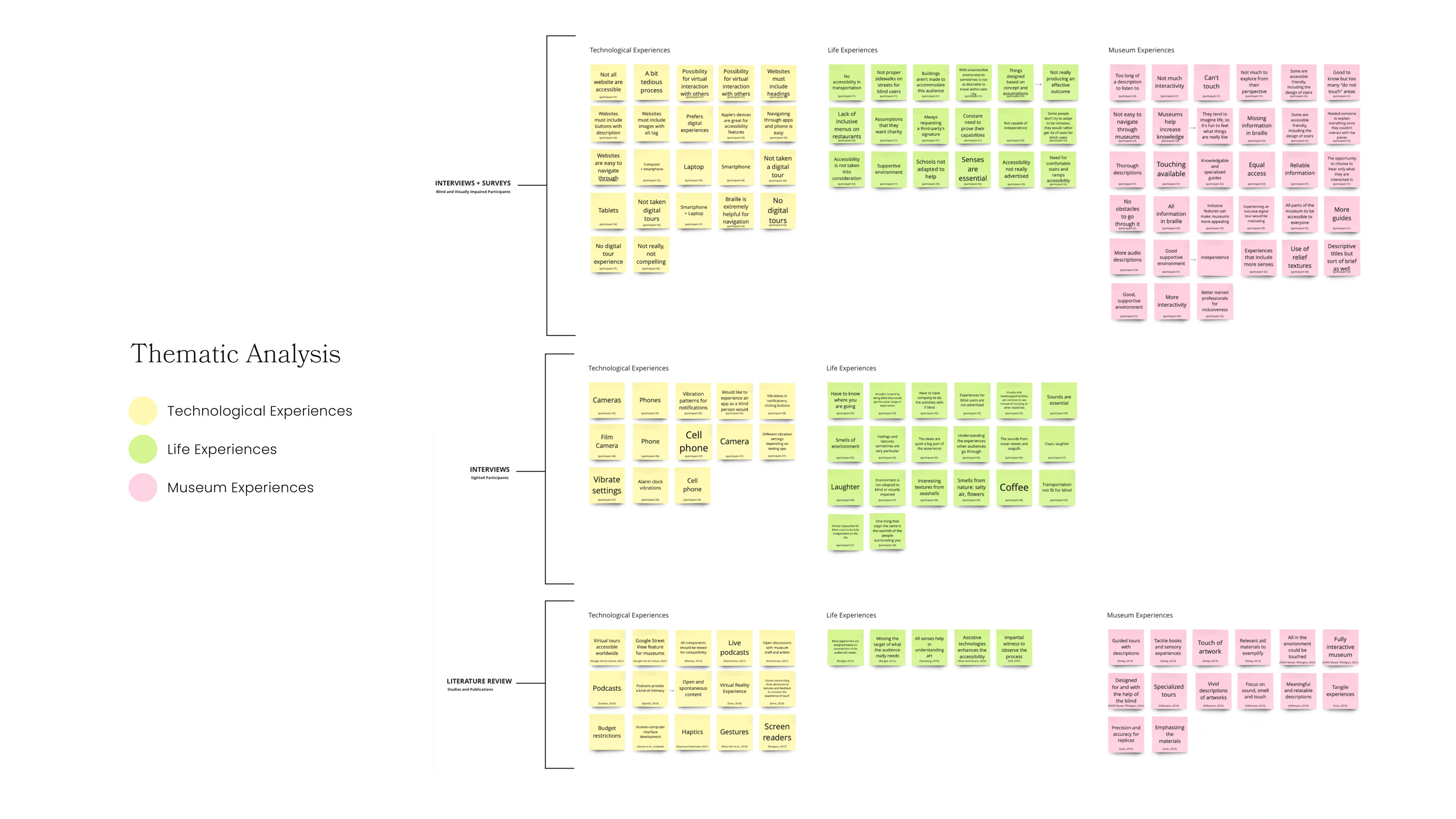
Each post-it utilized included the number of participant the quote was taken from, for easier and most acccessbile reference.
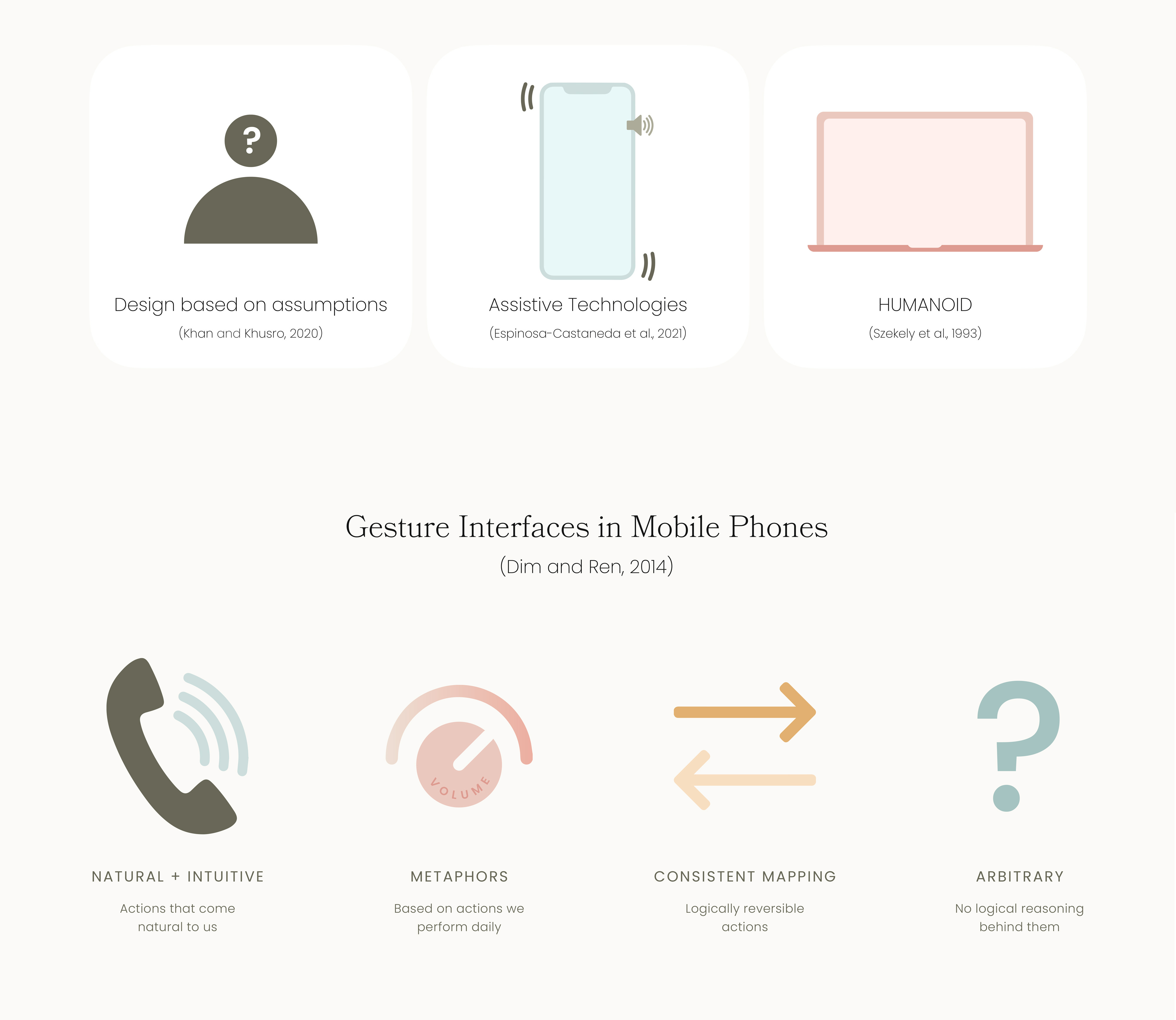
Some of the key findings reflected the constant mistake of designing based on the assumption of what the audience needs instead of consulting with them. It was also highlighted the importance of assistive technologies (such as haptics and gestures) to improve comprehension, and the use of HUMANOID—an HCI model that establishes the main development requirements such as achievable tasks, balance of 1D and 2D for all users, access to all objects, etc.).
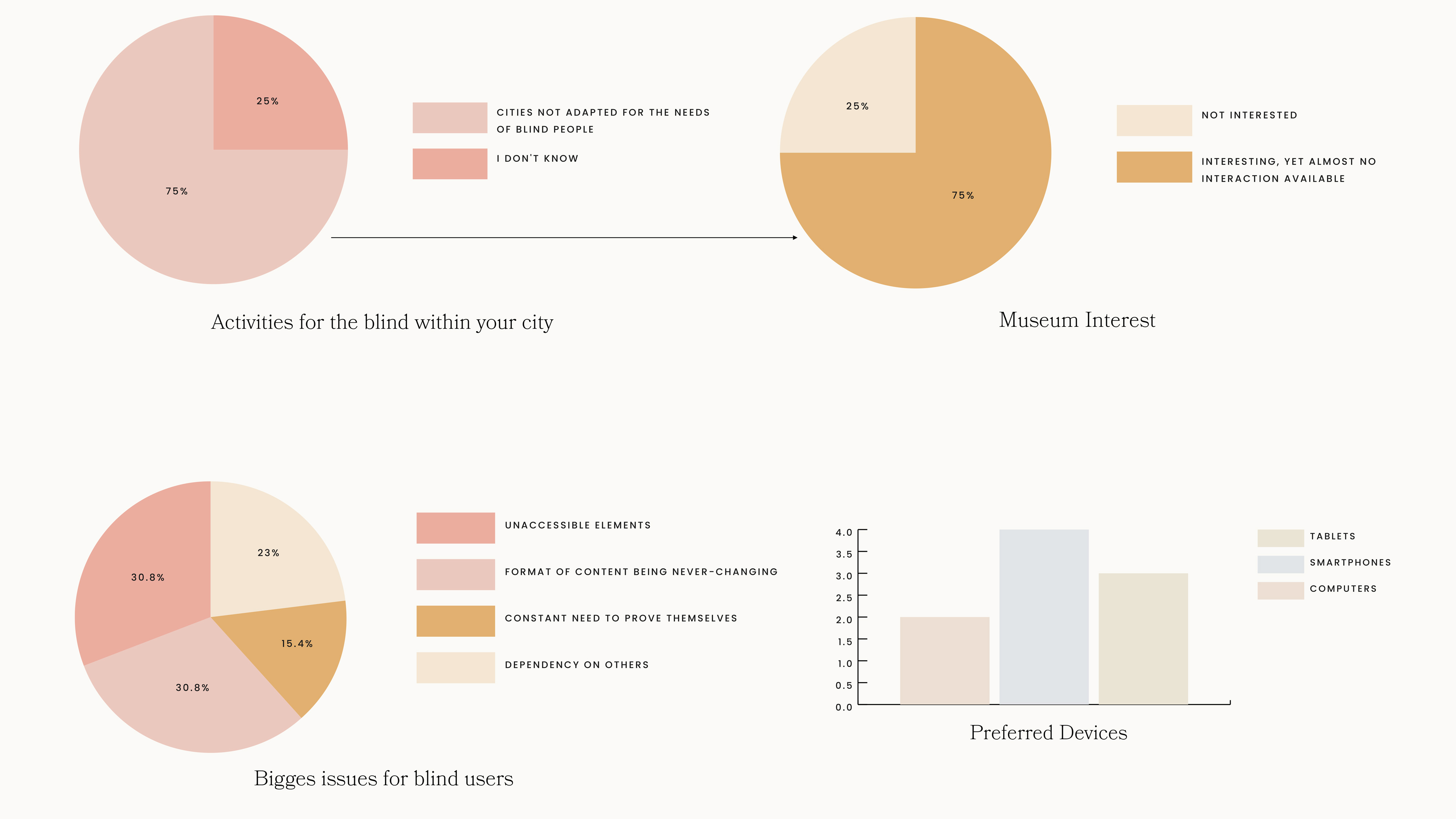
The interviews and surveys showed that 75% of participants thought cities were not adapted to the needs of blind users, and this directly correlated to the interest of the audience on getting involved in activities—such as attending museums
Some of the biggest issues for blind users are unaccessible elements in their environment and the presented information always in the same format. Even if the inclusive approach is functional, it is not as exciting for users.

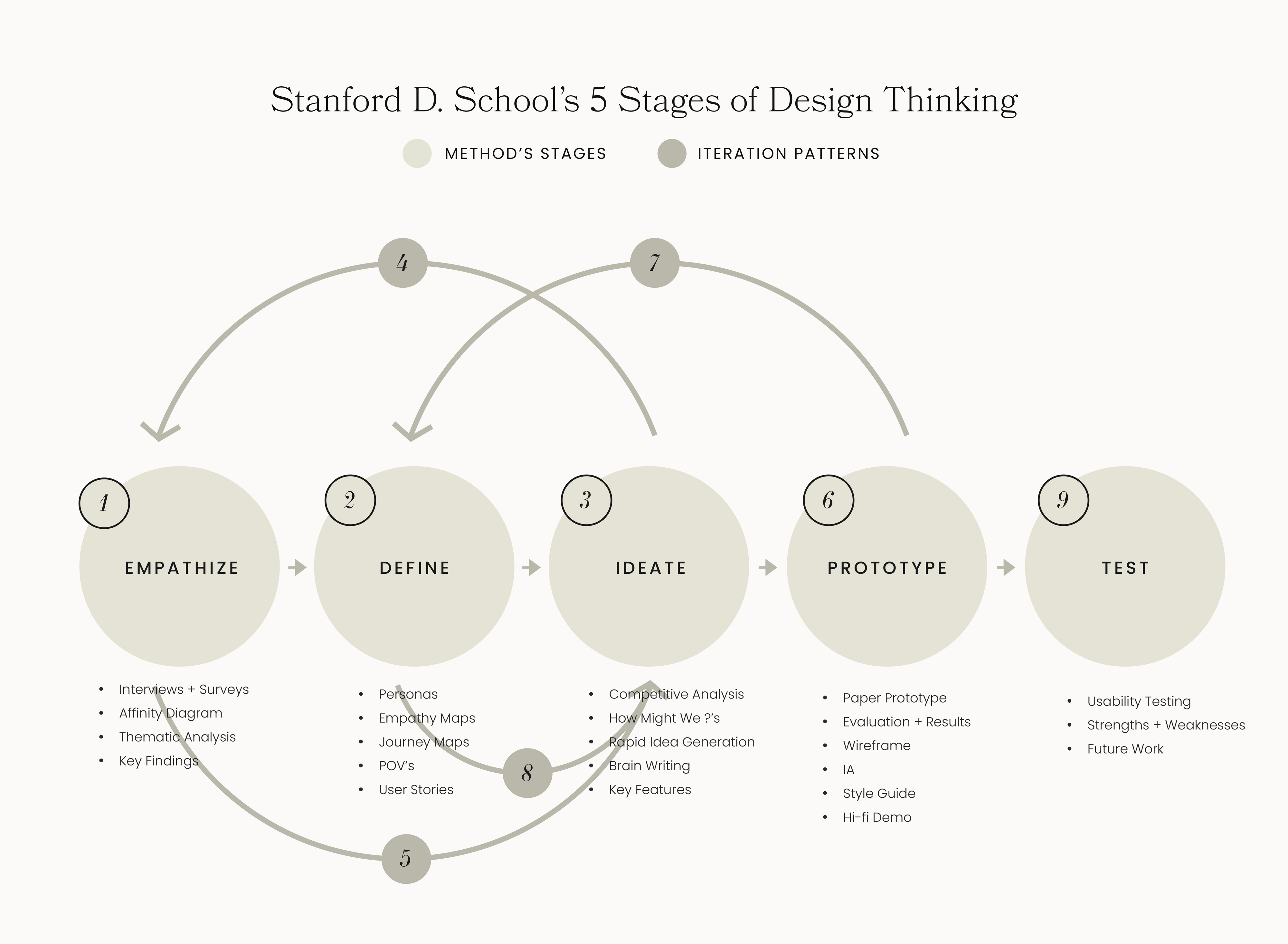
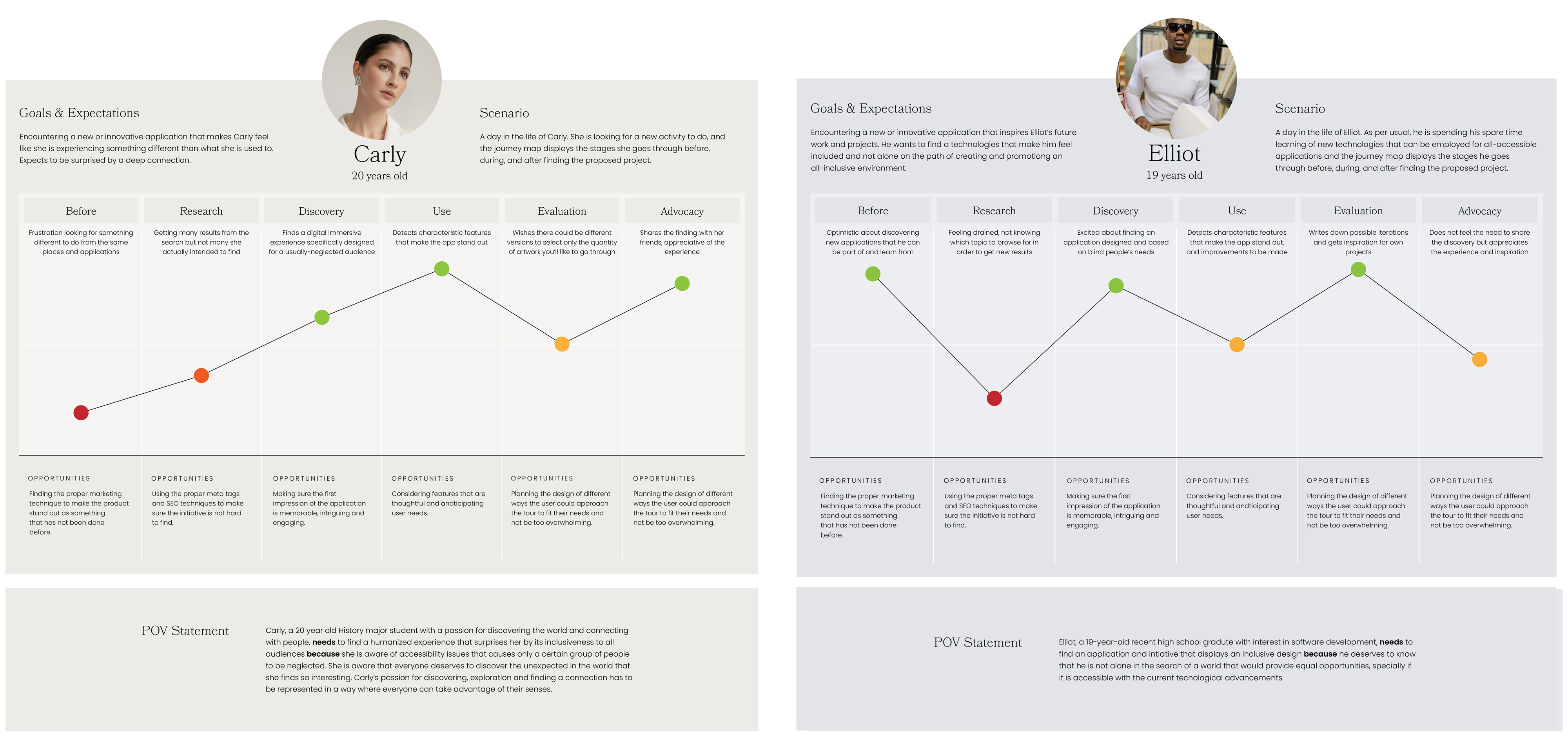
The areas of opportunity discovered through their journey maps were:
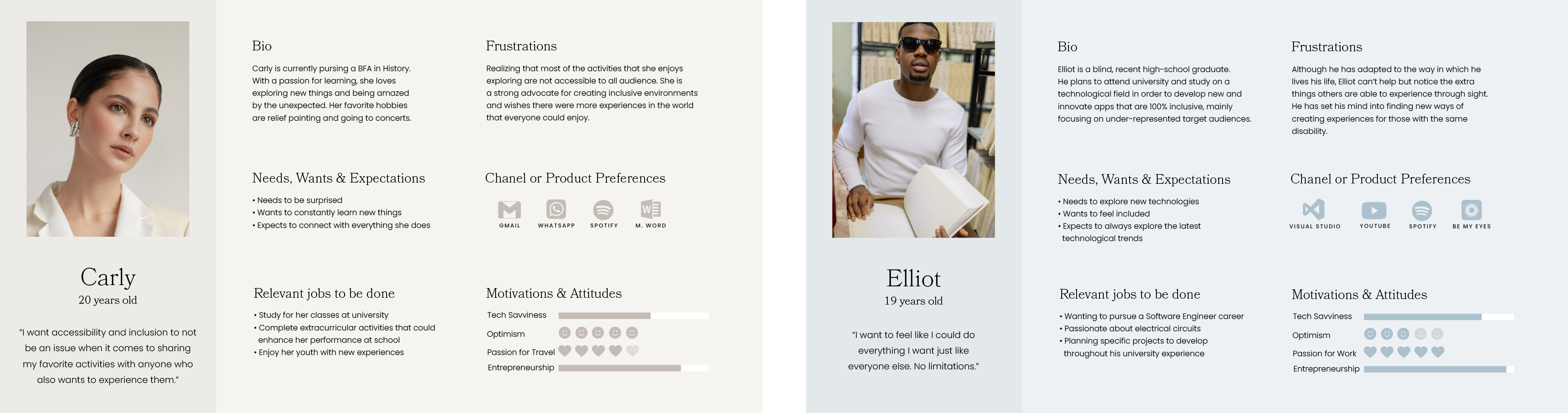
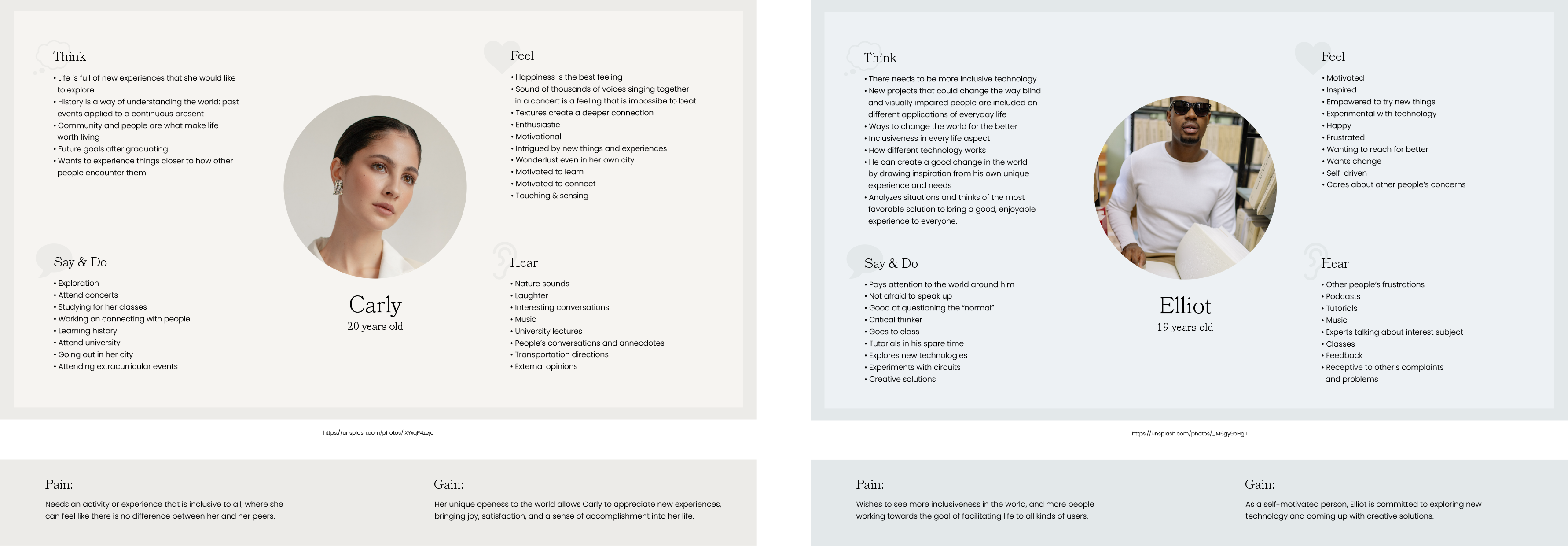
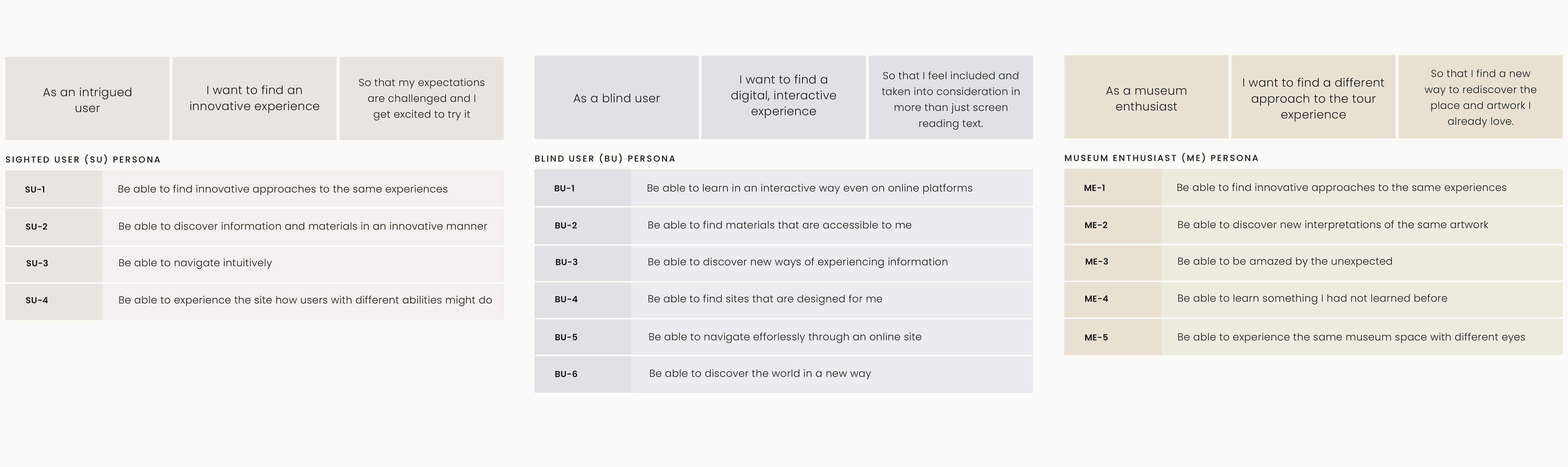
The user stories created were considered from three points of view: an intrigued user, a blind users, and a museum enthusiast. These statements served as basis of the HMW questions.

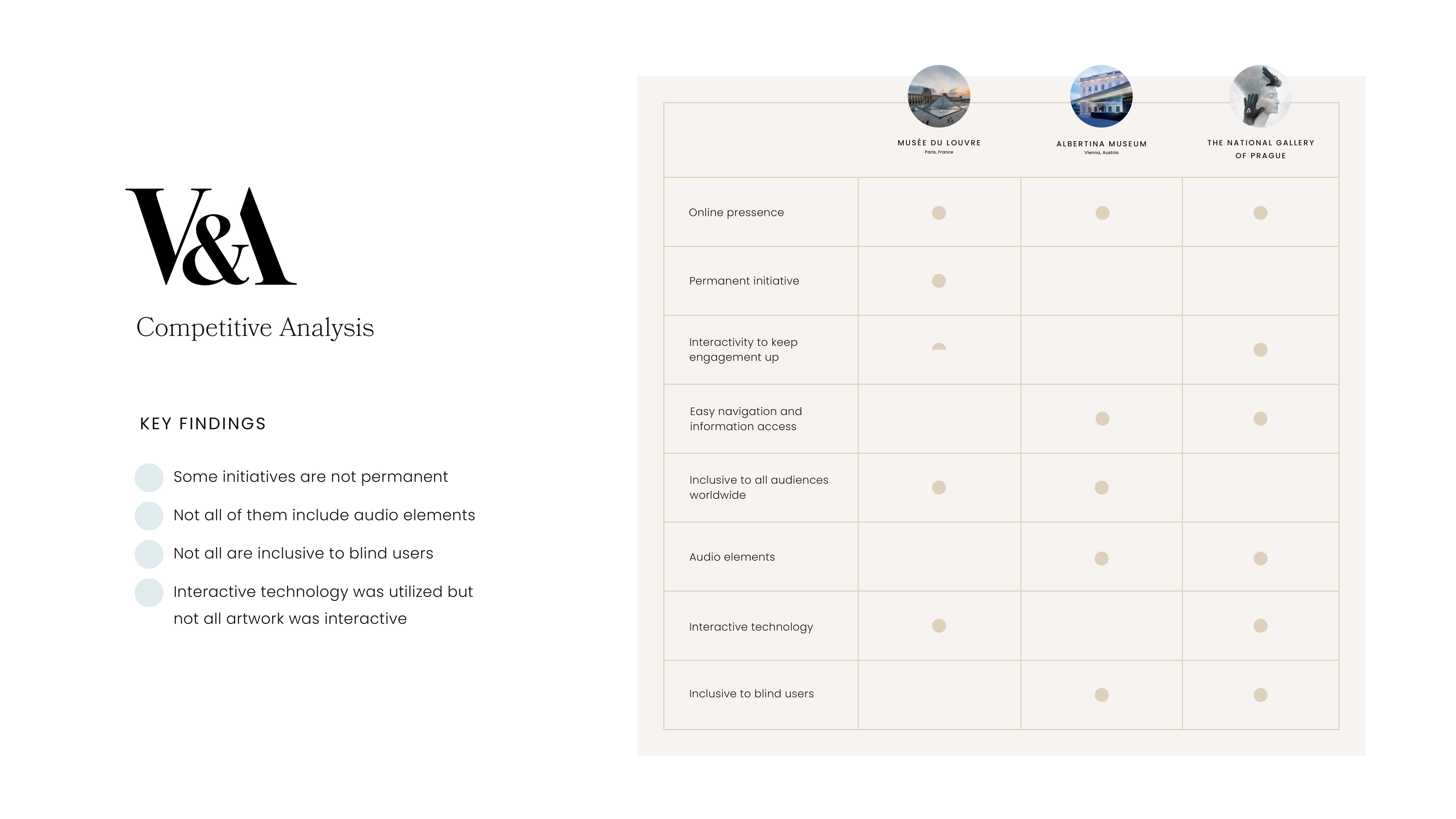
The V&A was chosen for its versatile collection, making it interesting to translate inot a digitial space. It was also one of the first museums to take initiative for in-person inclusiveness, so it would be fitting to take the first steps into digital inclusiveness.
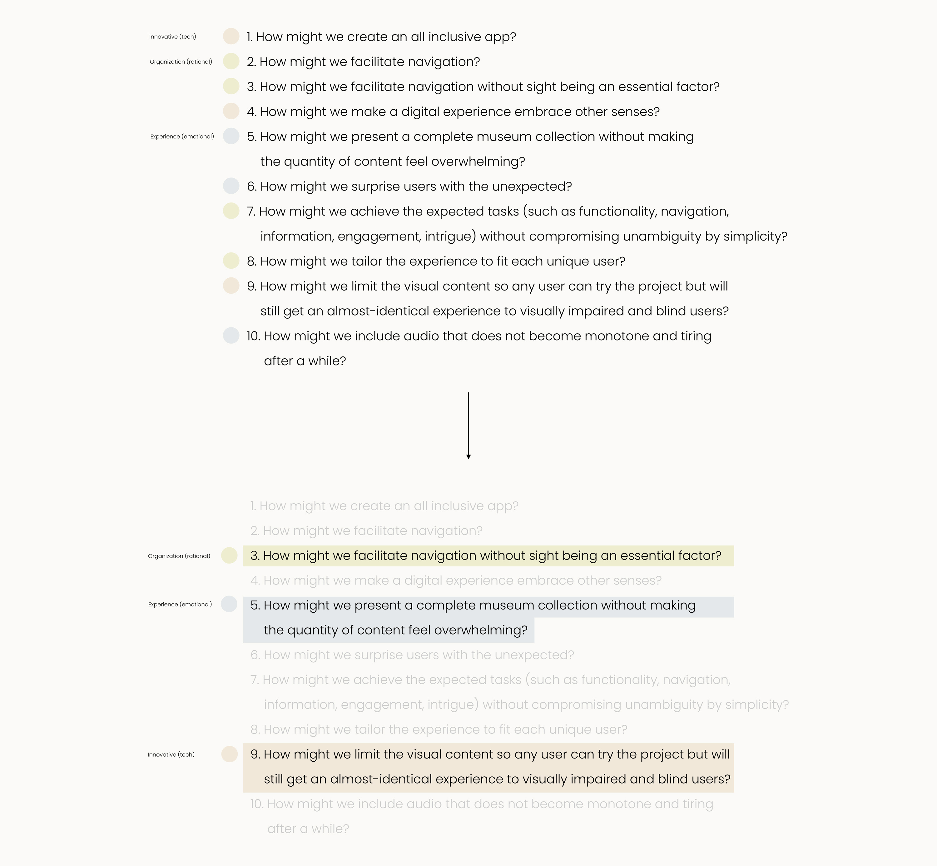
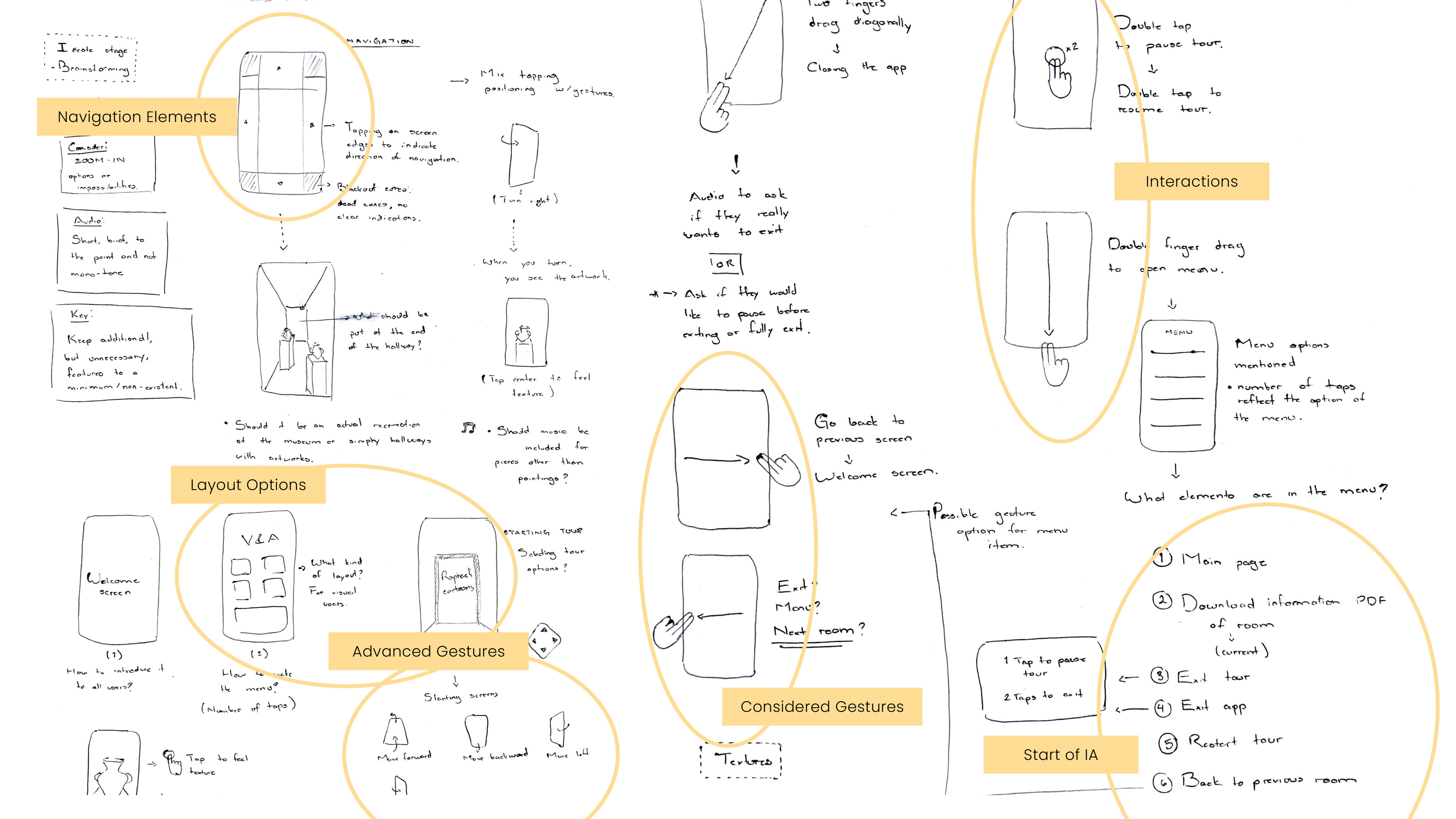
This was the first ideation technique implemented. The questions were categorized into 3 main themes: innovative (tackling all technological aspects), organizational (rational flow of things), and emotional (the user's experience). One question was highlighted from each category as a main task to focus on.
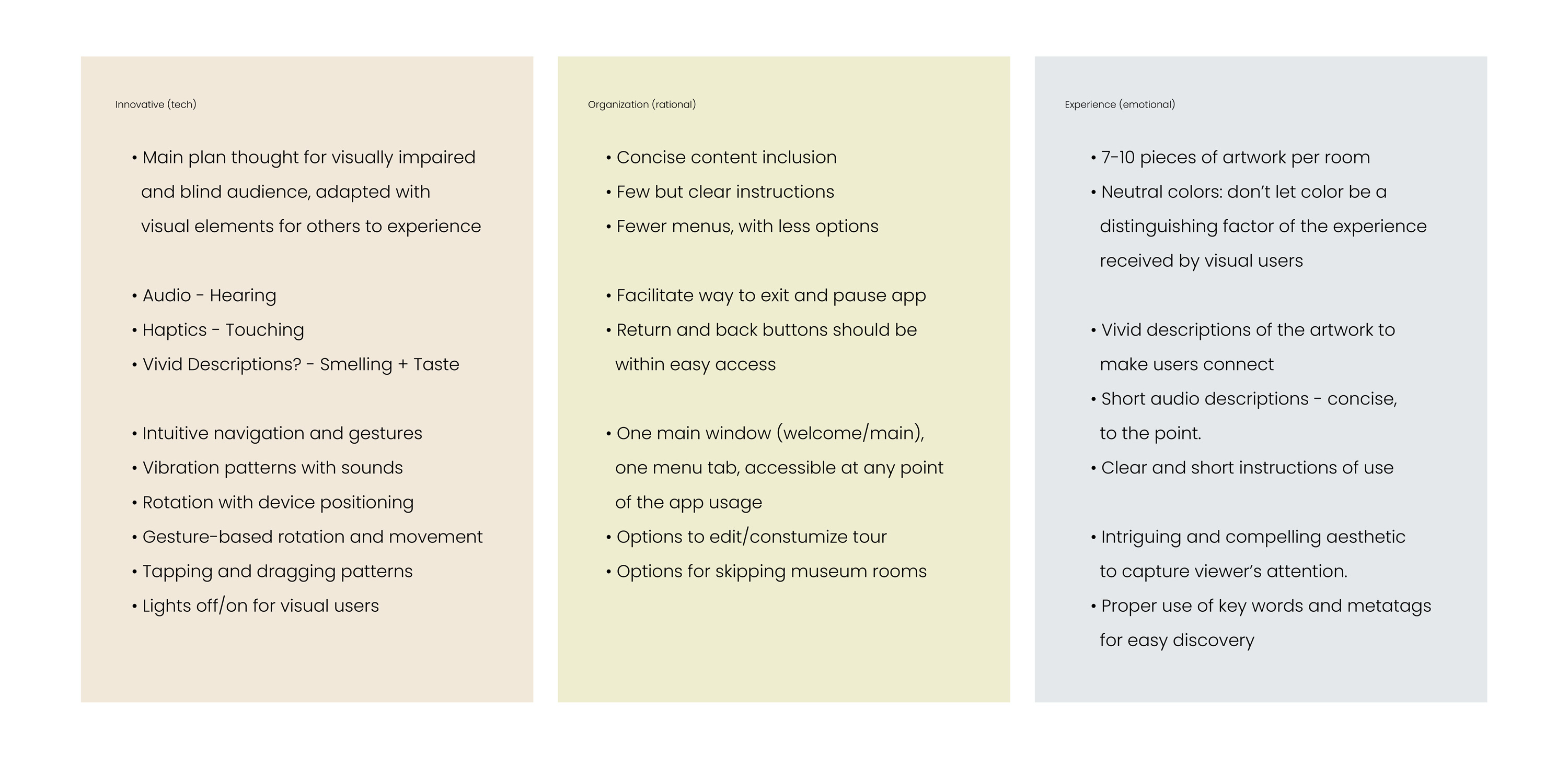
Brainstorming ideas and possible solutions to the previous questions.
Implemented to provide a specific insight into the design of the app.
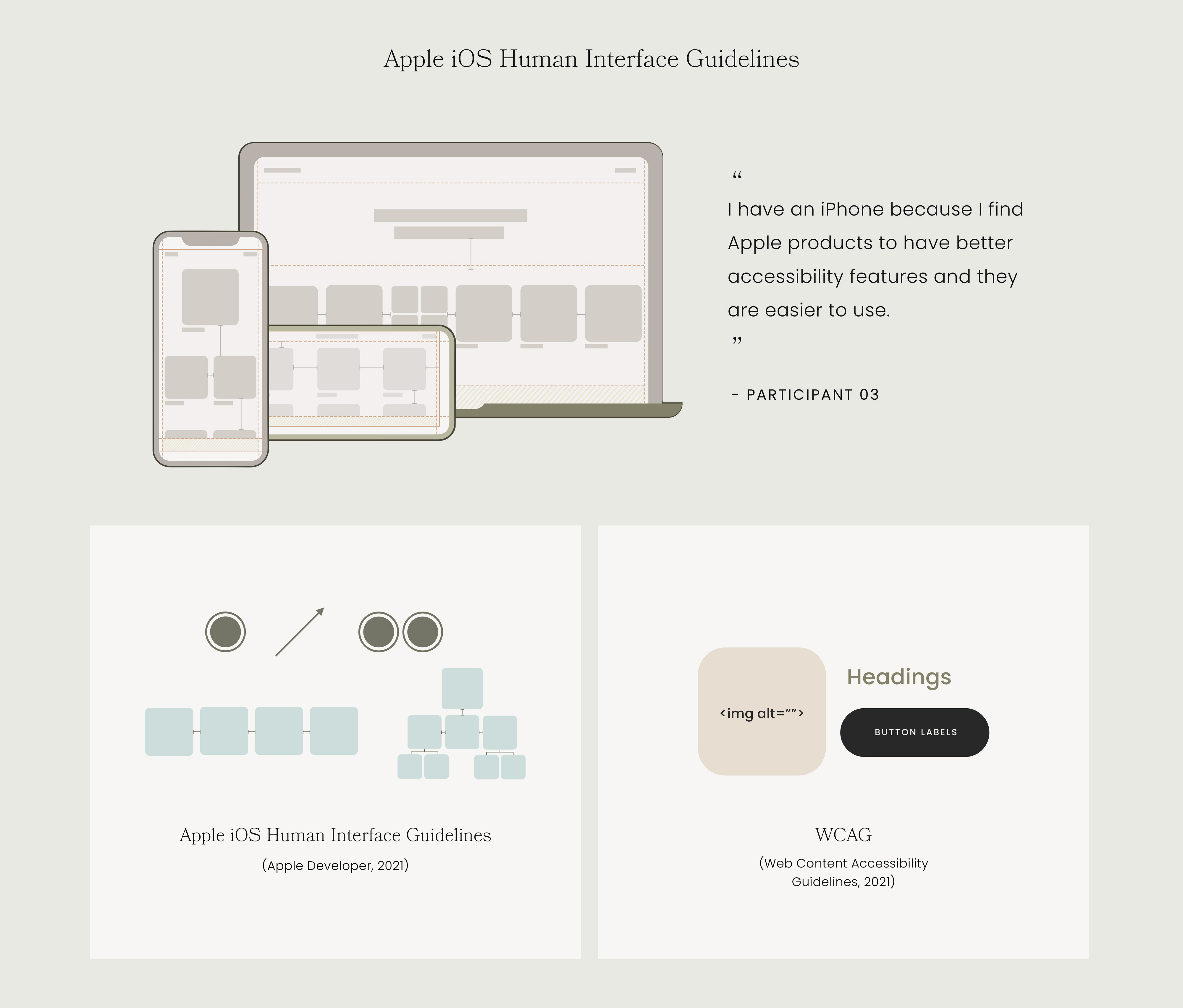
Based on a participant's specific mention of the well-designed, accessible features, Apple iOS Human Interface Guidelines were chosen as the design rationale. They also have well-considered metaphoric gestures, and a combination of flat and hierarchichal navigation—which was implemented to facilitate user's navigation. The Web Content Accessibility Guidelines were also referenced.

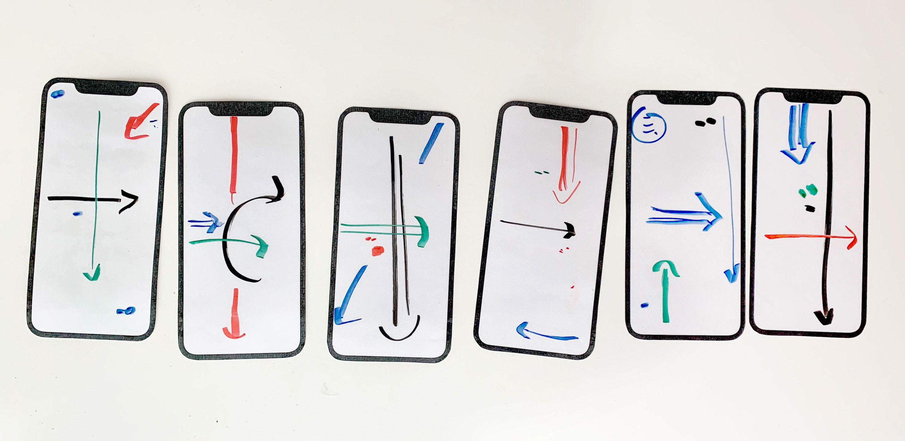
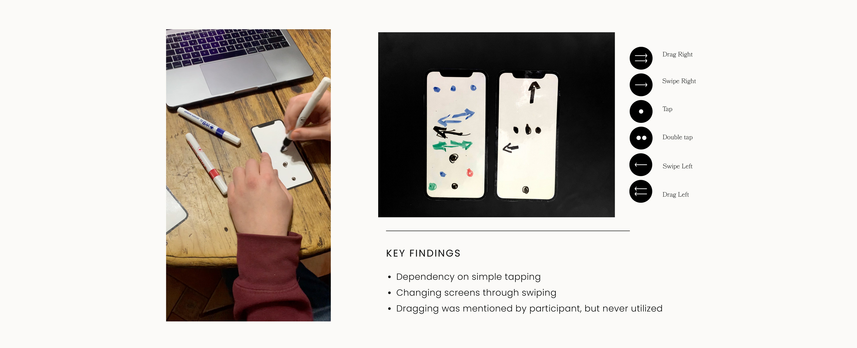
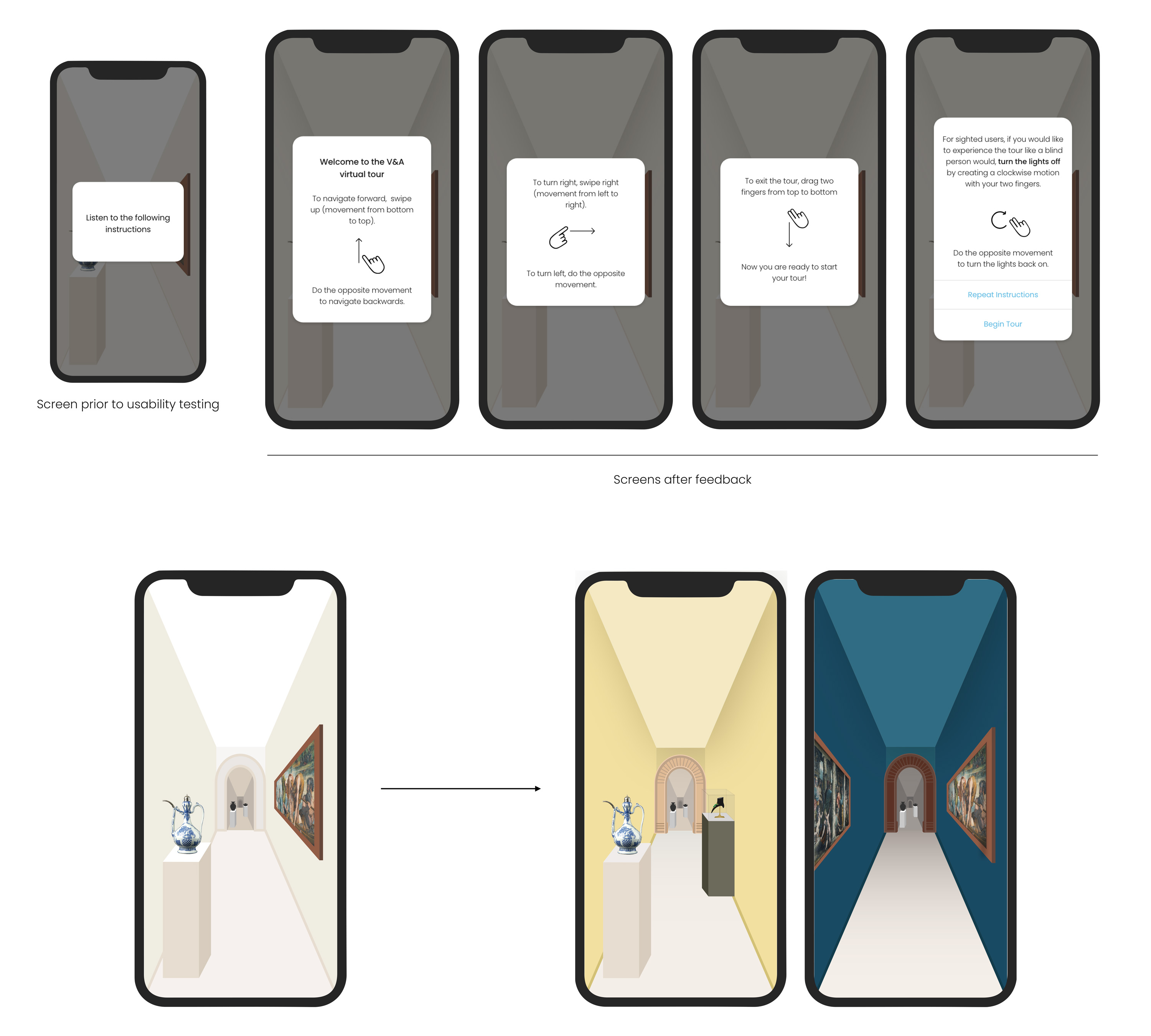
A different approach was taken during paper prototype testing. The participant was given 3 different task scenarios and they had to write the directional lines and gestures of how they would navigate through the app. This with the purpose of better understanding users' interactions.
The user flow relfects the simplicity in connectivity which will ease the navigation for users.
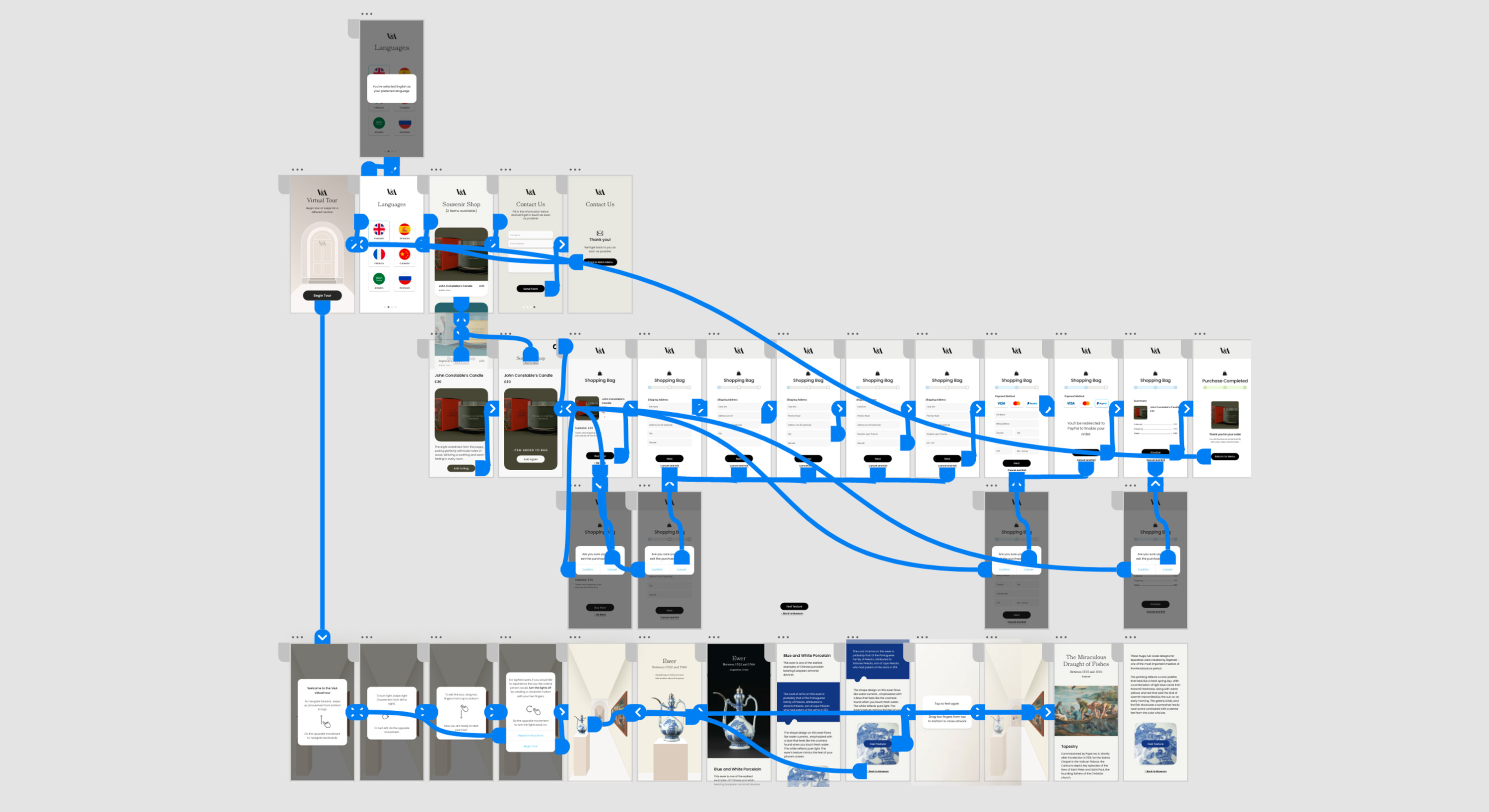
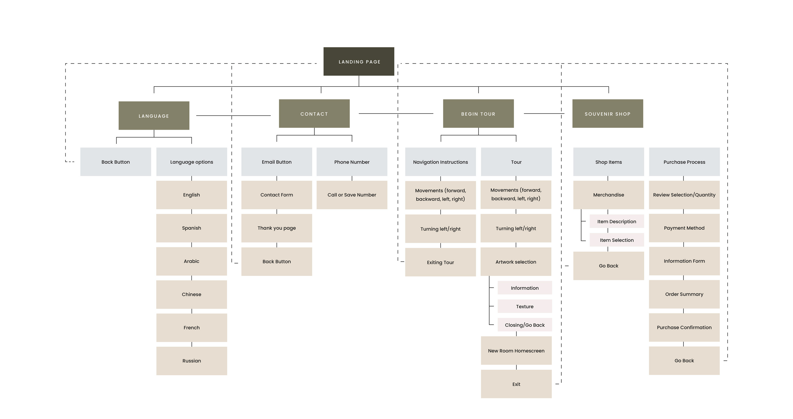
The I.A., as explained before, reflects a flat navigation for the menu and then opens up to a hierarchichal navigation, showing the connectivity between pages.
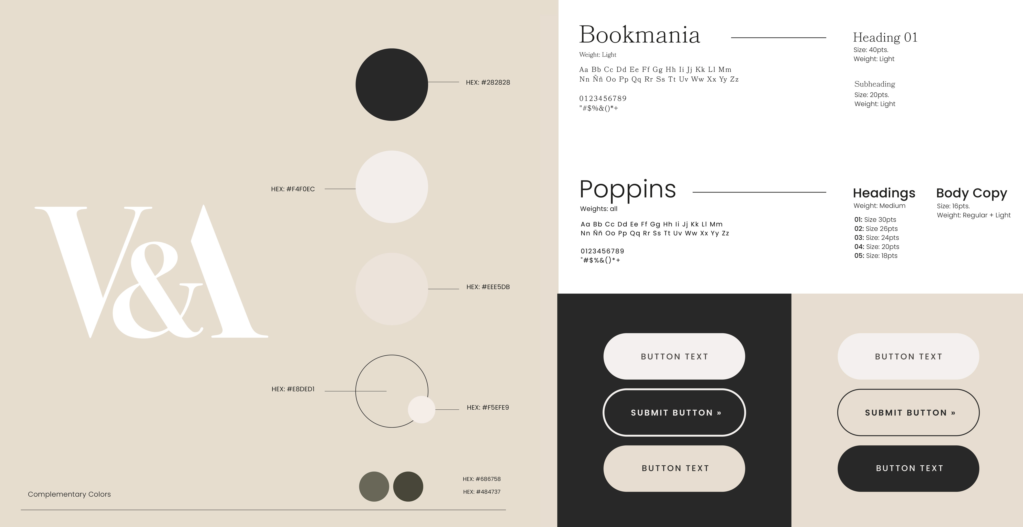
This is a condensed version of the branding created, proposing neutral colors in order for it to not be a determining factor on the experience of users.
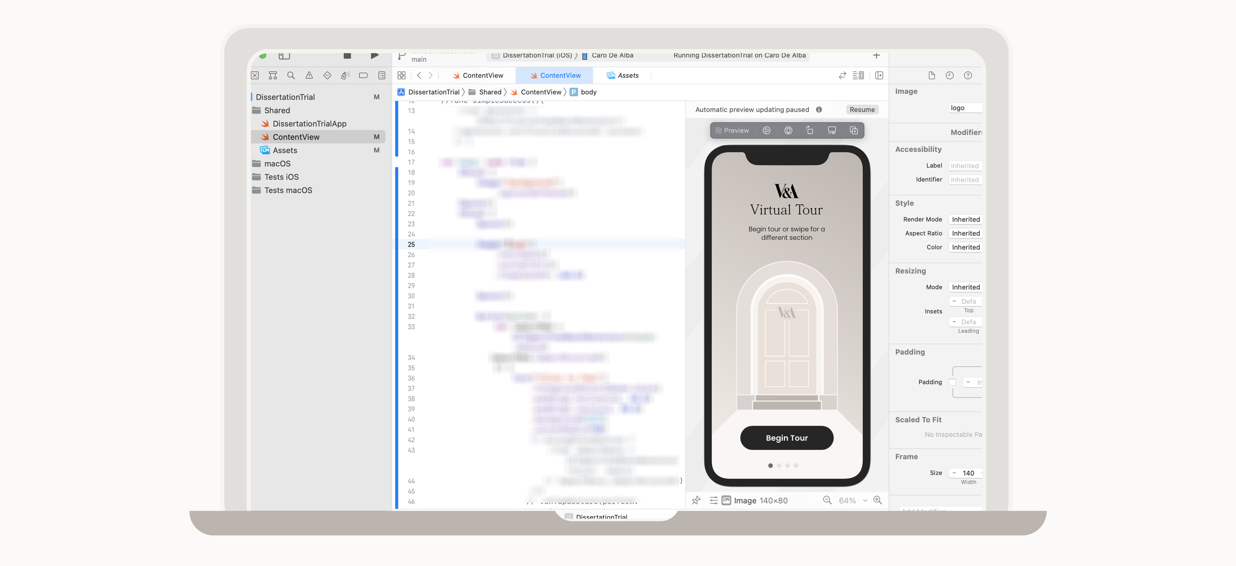
The main softwares used for prototyping have been Adobe XD, Adobe Illustrator and Xcode. This app is designed based on Apple iOS Human Interface Guidelines, and closely follows its guidelines while programming with Swift UI.
These are the screens for the app's main navigation. As it uses a flat system, beside the bottom elipses, a slight change in background color lets sighted users know when they are switching screens.
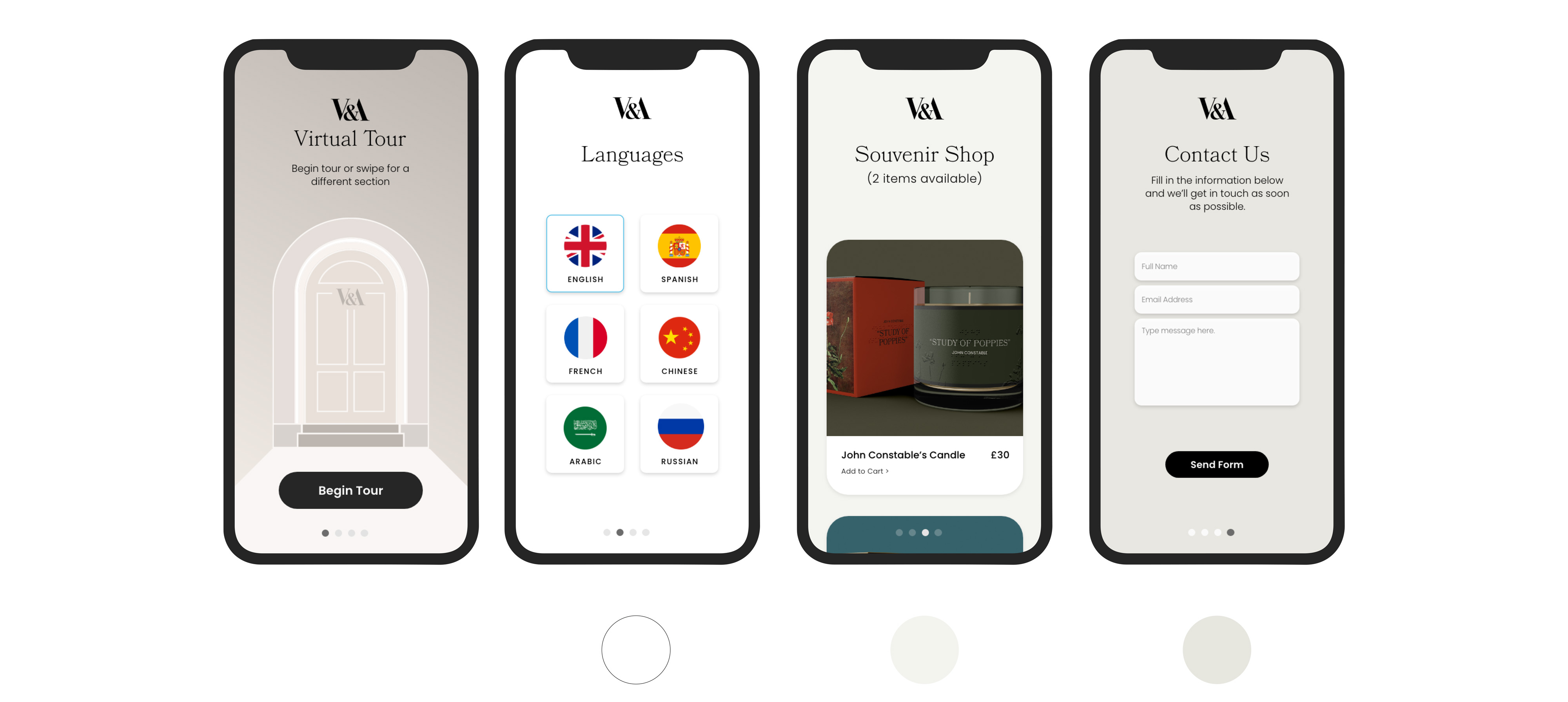
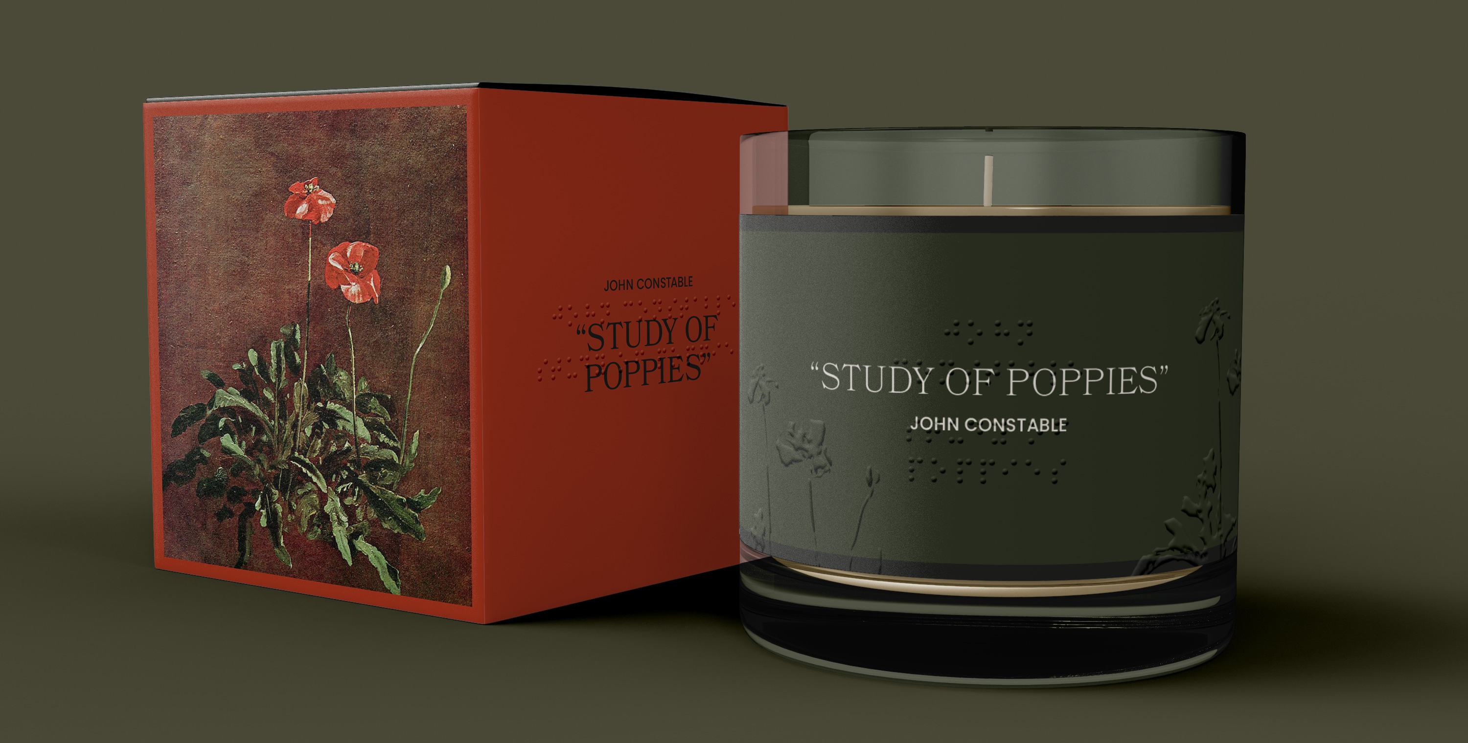
As found during user research, the sense of smell contributes greatly to the experience of users, even in indoor spaces like museums. To incorporate this, the idea of the souvenir shop was developed. A place in which the app could sell products like candles that reflect the smell of paintings. The following candle was designed to exemplify the idea.
An important discovery from the usability testing session was the need for visual instructions for sighted users. Also, the implementation of more color to actually reflect the environment of the museum.
Xcode was utilized to code with SwiftUI programming language and generate the feedback responses to let users know they have effectively performed an action.
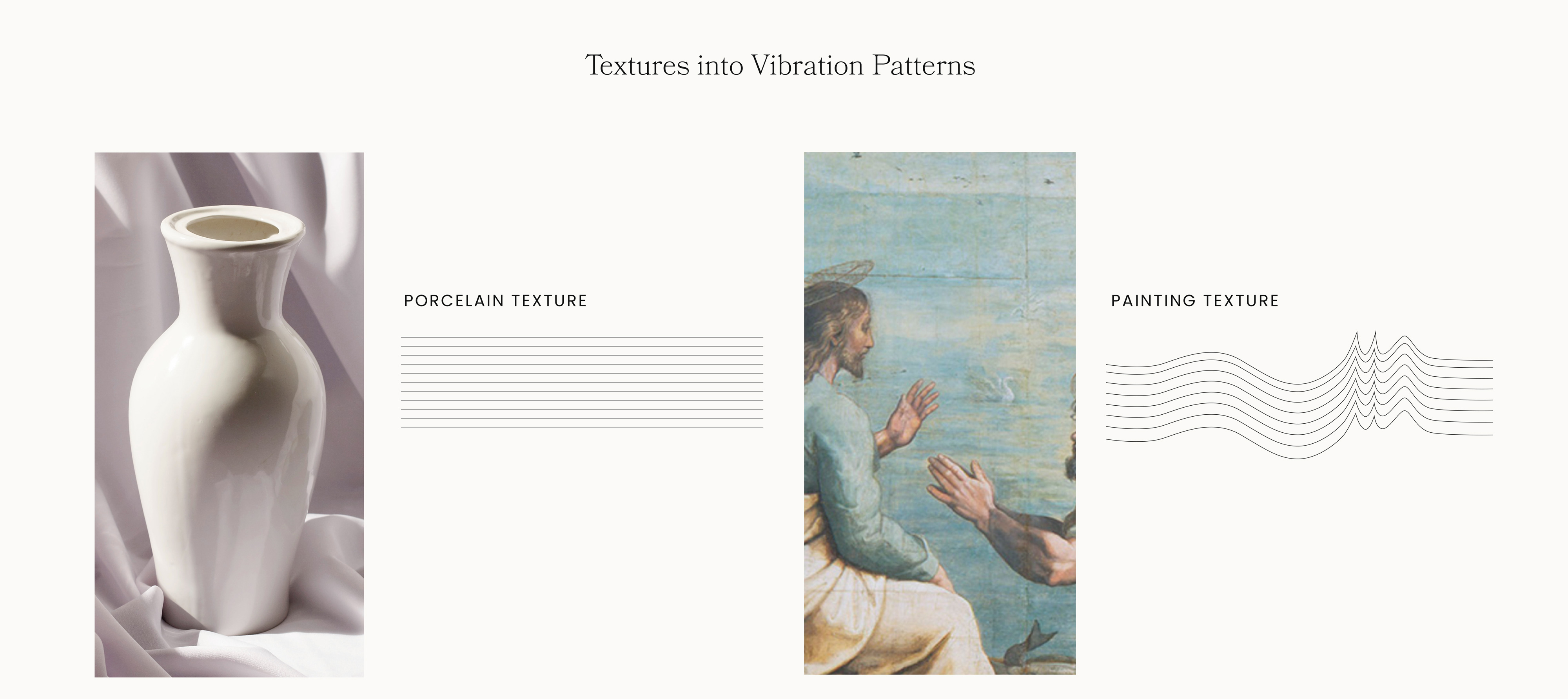
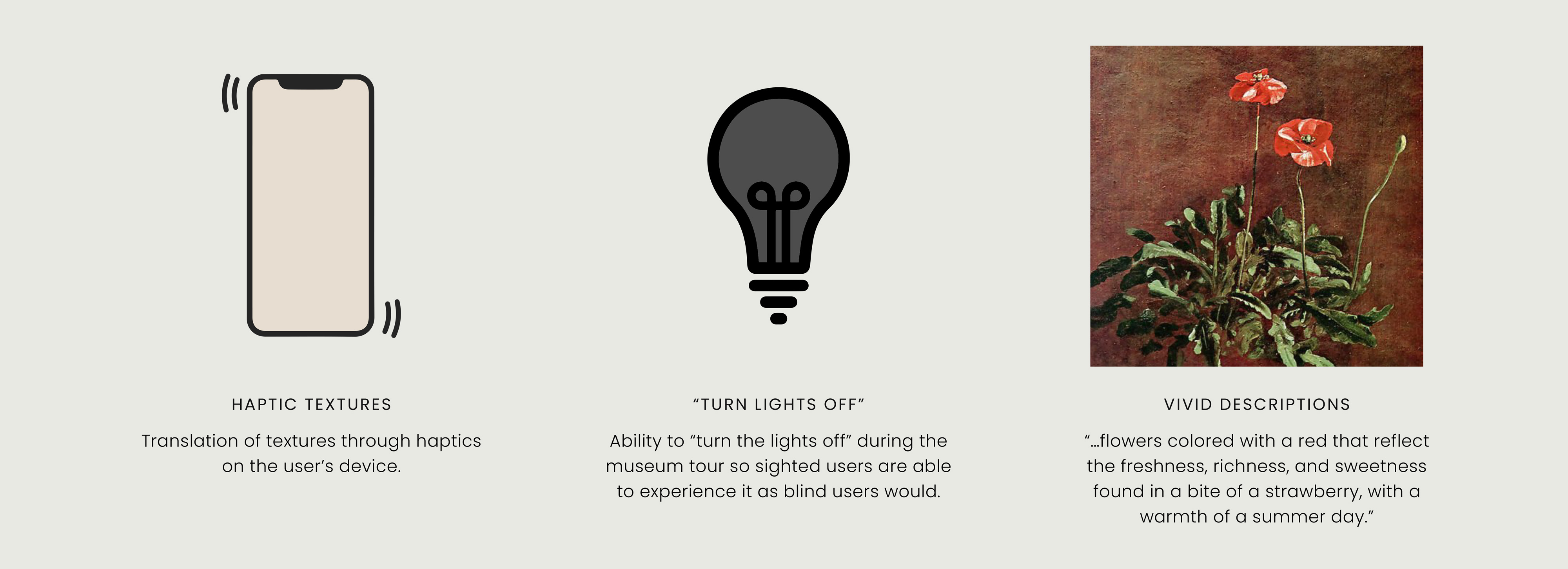
One of the main features of the app is its interactiveness, therefore users will be able to feel the artwork by the use of haptics. While programming with Swift UI, haptic responses were customized into vibration patterns with different parameters to mimic the texture found on a painting, sculpture, or other art piece.